ADAM
WHEELER
GRAPHICDESIGNER
Creative. Precise. Professional.


Adam Wheeler
GD Case Studies
UX Case Studies
About
Contact
Copyright Adam Wheeler. All rights reserved

Hong Kong
Cafe
Download PDF

• Miro
• Figma
• Excel


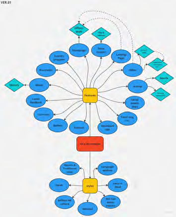
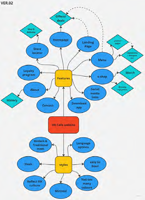
Going from the research stage, I went into ideating and started off by mapping out
features, designs etc. then condensed the ideas down until I ended up with the map on the right.


A


A


B


Onward to the next project...
Being my second project, and one mostly created from my own imagination, I still was learning a lot, I feel that I have developed further with this one, I only wish i had access to the Hong-Kong user base to get better research, but this was still fun overall.
In conclusion...

The Finale
Final A/B testing
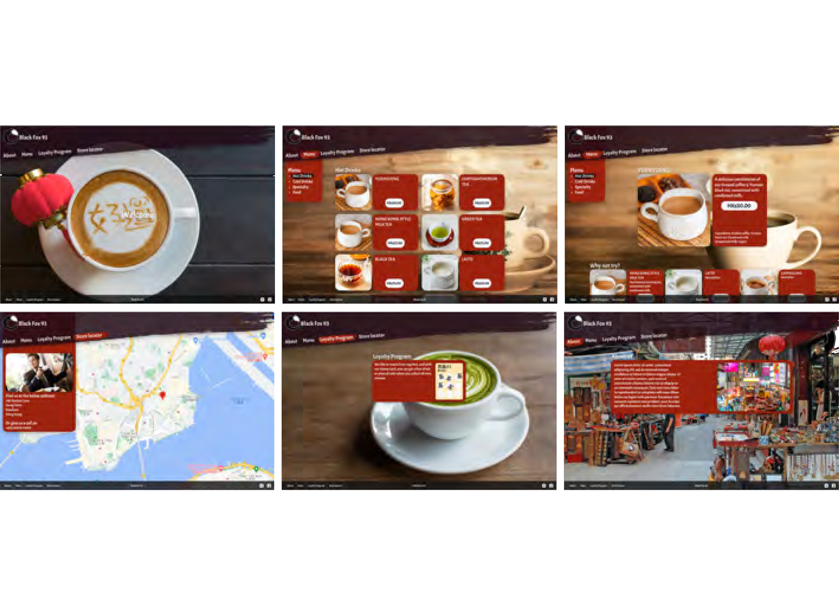
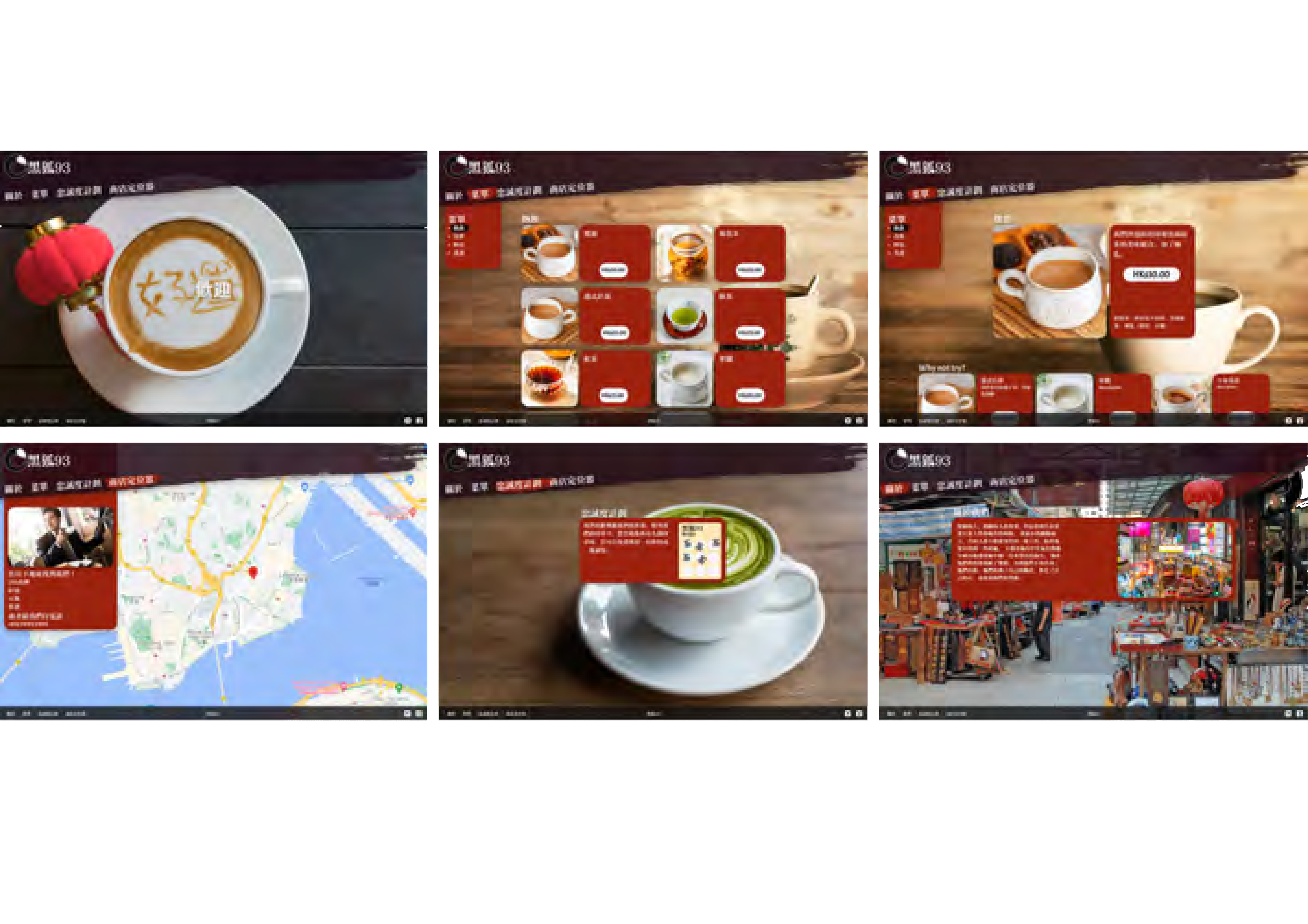
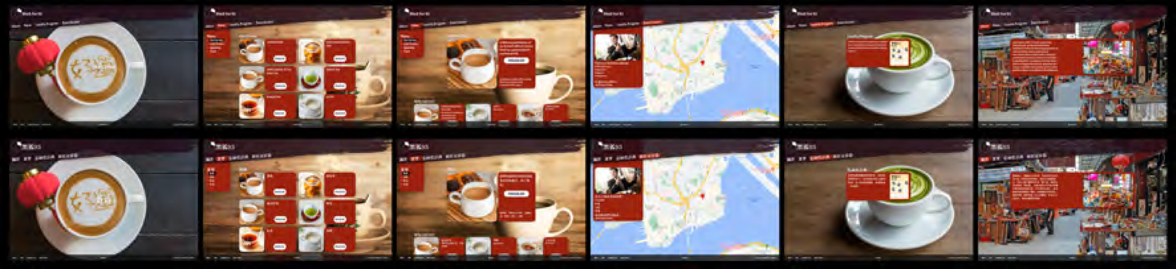
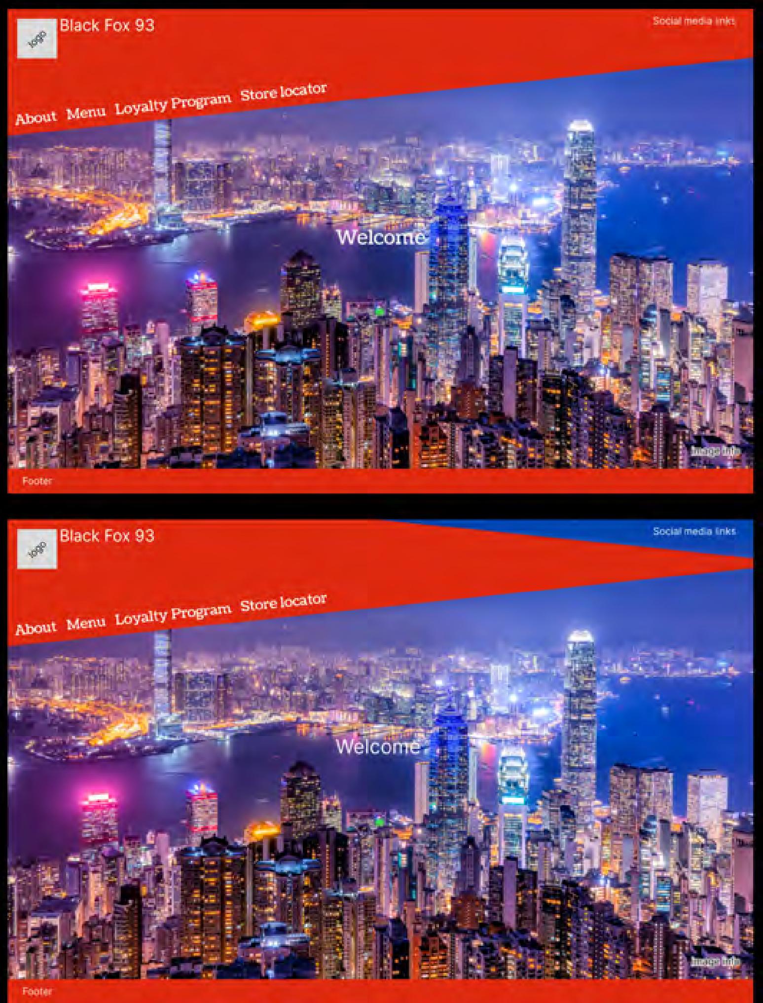
Armed with the above designs i conducted a short A/B test to gauge as to which version was preferred, which gave the majority result of B and the final version seen just below where i tries to give more of a traditional Chinese calligraphy feel.
Based on the results and feedback I received from the user testing, I got to work
creating a more fleshed out High-Fi mock-up, and an alternative to it. I wanted to include the colour red, as it is a lucky colour in Chinese culture and so tried to incorporate the same colour red as the flag of Hong-Kong, but didn't end up working , so in the later version I went with a more deeper red instead.
2nd & 3rd Mockup
User testing
With the above mock-up I then conducted some User Testing, to gauge where the design was, if it worked, issues etc. from that I got some interesting results that helped to shape later designs.
1st Mockup
The next step was to create a Mid-Fi mock-up of the above wire-frame for better use in the upcoming user testing, this mock-up contains basic typography and icons, obviously nothing is near finalisation.
B
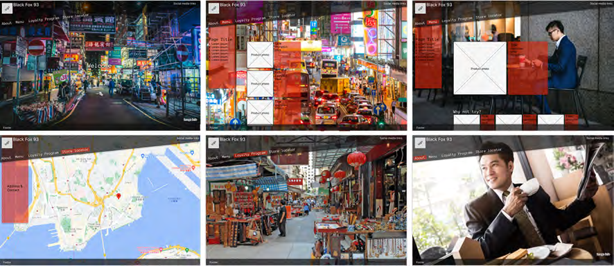
While looking at the Lo-Fi wire-frame I had the idea of angling the menu bar, to try and make the website a bit more interesting.
From this I created two versions and then did a quick A/B test to gauge which was better, version A won out.
From the initial ideating stage I then went into creating a sitemap, trying to keep the website to a level of minimalism that doesn't venture into boring & cold and still keeping the features that that were mentioned in the user research, from this I then started producing a basic Lo-Fi wire-frame for four of the web pages, the homepage, the menu, the product page & the store locator page.
Wireframing
Ideate
website that will drive traffic?"
"How might we translate the characteristics of the coffeeshop to a
With the User research completed, I moved on to generating a HMW statement to work with for the rest of the project, picking the following;
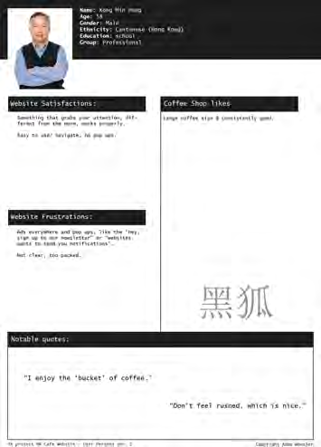
The second User Persona is centered around the older demographic, this gentleman is 58 years
old, and enjoys a coffee shop with good
coffee and that is easy
to navigate & easy going, no feelings of being rushed & not excess 'flash'.
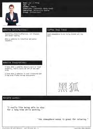
The first User Persona is a young lady, a professional that likes to get some work done while at a coffee shop, enjoying the atmosphere.
From here I created two user personas based upon the information of the main participants in the user research, from this it was it was rather interesting to see that the users could be summed up into the below personas.
User Personas
Before carrying on with the rest of the project, i decided to go into a bit more detail for the imaginary coffee shop that i would be designing for, as thus the Black Fox 93 was born...
After the User research I then moved on to doing some competition research, which I then broke down into a spreadsheet. the reason behind this was to see what website pages & features the other companies had, a from that I could better gauge what features were a must and what others could potentially be left behind.
Based of the research that I conducted, it became apparent that the main driving force behind why a coffee shop establishment is preferred over another (besides the taste of the coffee) is the atmosphere and general overall vibe of the establishment. Regarding website design, users prefer a more simplified layout, easy to use and not packed full of unnecessary feature & pop ups.
I started off by conducting user research & organising the data into an Excel spreadsheet and then from there i started creating a simple affinity diagram to organise the pros & cons comments into the relevant columns, just by doing this a trend in both the good & bad had already formed.
As this project was created from a design prompt for a coffee shop based in Hong Kong, and me being based in the UK, finding Hong-Konger cafe users was rather difficult, so i ended up using UK citizens and then simply extrapolated the data for a broader HK user base.
This project was self created from a design prompt
for the creation of a wireframe for a coffee shop
situated in Hong Kong, as you will see below,
I ended up taking it a bit further than a wireframe.
Research
Programs used:

// END OF CASE STUDY
ADAM
WHEELER
GRAPHICDESIGNER
Creative. Precise. Professional.


Adam Wheeler
GD Case Studies
UX Case Studies
About
Contact
Copyright Adam Wheeler. All rights reserved

Hong Kong
Cafe
Download PDF

• Miro
• Figma
• Excel


Going from the research stage, I went into ideating and started off by mapping out
features, designs etc. then condensed the ideas down until I ended up with the map on the right.


A


A
B

Onward to the next project...
Being my second project, and one mostly created from my own imagination, I still was learning a lot, I feel that I have developed further with this one, I only wish i had access to the Hong-Kong user base to get better research, but this was still fun overall.
In conclusion...

The Finale
Final A/B testing
Armed with the above designs i conducted a short A/B test to gauge as to which version was preferred, which gave the majority result of B and the final version seen just below where i tries to give more of a traditional Chinese calligraphy feel.
Based on the results and feedback I received from the user testing, I got to work
creating a more fleshed out High-Fi mock-up, and an alternative to it. I wanted to include the colour red, as it is a lucky colour in Chinese culture and so tried to incorporate the same colour red as the flag of Hong-Kong, but didn't end up working , so in the later version I went with a more deeper red instead.
2nd & 3rd Mockup
User testing
With the above mock-up I then conducted some User Testing, to gauge where the design was, if it worked, issues etc. from that I got some interesting results that helped to shape later designs.
1st Mockup
The next step was to create a Mid-Fi mock-up of the above wire-frame for better use in the upcoming user testing, this mock-up contains basic typography and icons, obviously nothing is near finalisation.
B
While looking at the Lo-Fi wire-frame I had the idea of angling the menu bar, to try and make the website a bit more interesting.
From this I created two versions and then did a quick A/B test to gauge which was better, version A won out.
From the initial ideating stage I then went into creating a sitemap, trying to keep the website to a level of minimalism that doesn't venture into boring & cold and still keeping the features that that were mentioned in the user research, from this I then started producing a basic Lo-Fi wire-frame for four of the web pages, the homepage, the menu, the product page & the store locator page.
Wireframing
Ideate
website that will drive traffic?"
"How might we translate the characteristics of the coffeeshop to a
With the User research completed, I moved on to generating a HMW statement to work with for the rest of the project, picking the following;
The second User Persona is centered around the older demographic, this gentleman is 58 years
old, and enjoys a coffee shop with good
coffee and that is easy
to navigate & easy going, no feelings of being rushed & not excess 'flash'.
The first User Persona is a young lady, a professional that likes to get some work done while at a coffee shop, enjoying the atmosphere.
From here I created two user personas based upon the information of the main participants in the user research, from this it was it was rather interesting to see that the users could be summed up into the below personas.
User Personas
Before carrying on with the rest of the project, i decided to go into a bit more detail for the imaginary coffee shop that i would be designing for, as thus the Black Fox 93 was born...
After the User research I then moved on to doing some competition research, which I then broke down into a spreadsheet. the reason behind this was to see what website pages & features the other companies had, a from that I could better gauge what features were a must and what others could potentially be left behind.
Based of the research that I conducted, it became apparent that the main driving force behind why a coffee shop establishment is preferred over another (besides the taste of the coffee) is the atmosphere and general overall vibe of the establishment. Regarding website design, users prefer a more simplified layout, easy to use and not packed full of unnecessary feature & pop ups.
I started off by conducting user research & organising the data into an Excel spreadsheet and then from there i started creating a simple affinity diagram to organise the pros & cons comments into the relevant columns, just by doing this a trend in both the good & bad had already formed.
As this project was created from a design prompt for a coffee shop based in Hong Kong, and me being based in the UK, finding Hong-Konger cafe users was rather difficult, so i ended up using UK citizens and then simply extrapolated the data for a broader HK user base.
This project was self created from a design prompt
for the creation of a wireframe for a coffee shop
situated in Hong Kong, as you will see below,
I ended up taking it a bit further than a wireframe.
Research
Programs used:
PORTFOLIO
// END OF CASE STUDY