ADAM
WHEELER
GRAPHICDESIGNER
Creative. Precise. Professional.


Adam Wheeler
GD Case Studies
UX Case Studies
About
Contact
Copyright Adam Wheeler. All rights reserved

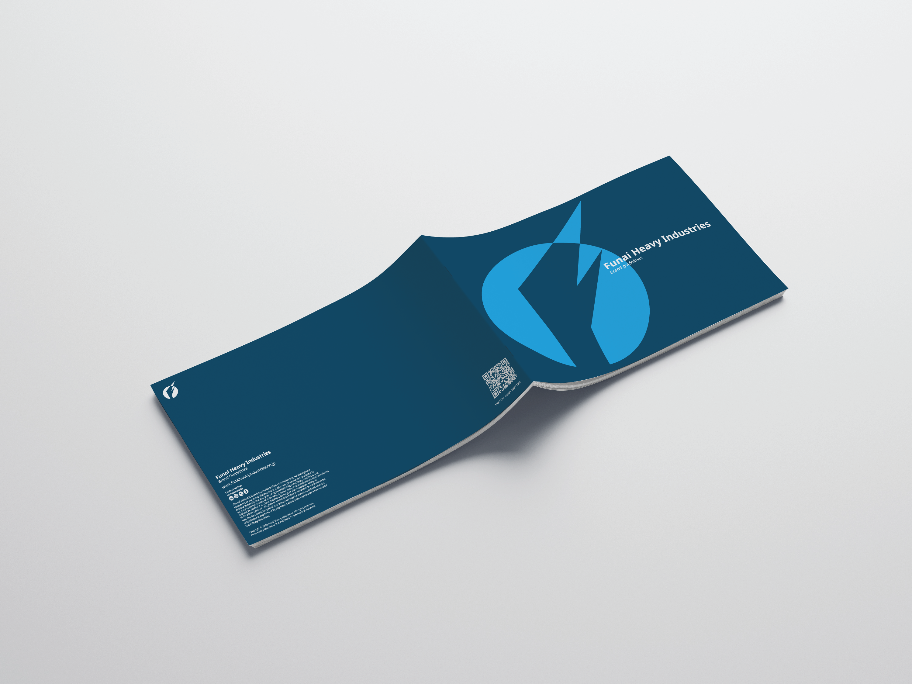

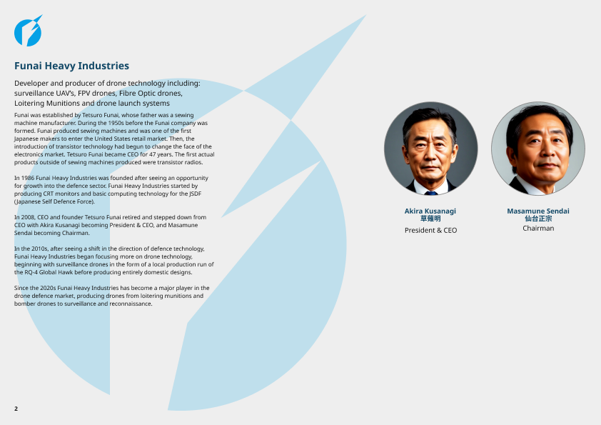
Funai Heavy Industries is a fictional defence manufacturer created as a personal branding project.
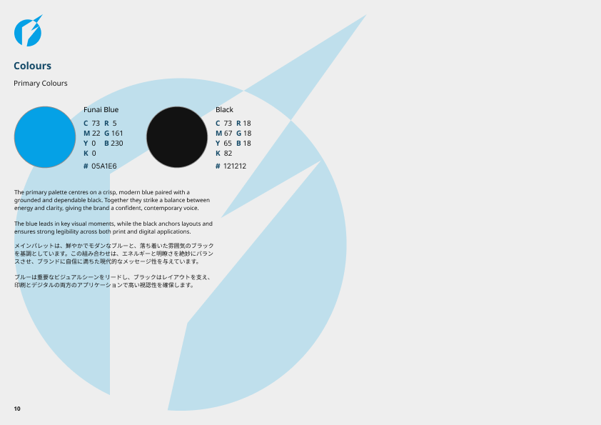
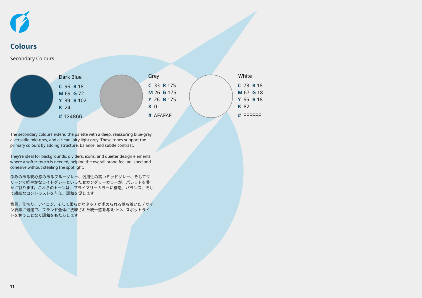
The objective was to develop a comprehensive brand identity & accompanying brand guidelines that communicate strength, precision & technological innovation while maintaining a professional & credible visual presence.
Rather than designing a single logo, the project explored how a defence company's identity could be expressed consistently across a range of applications.
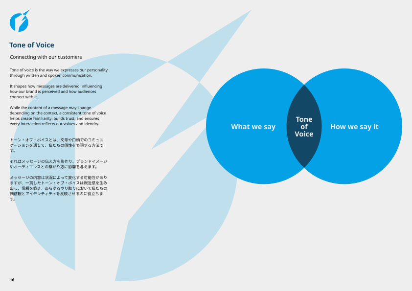
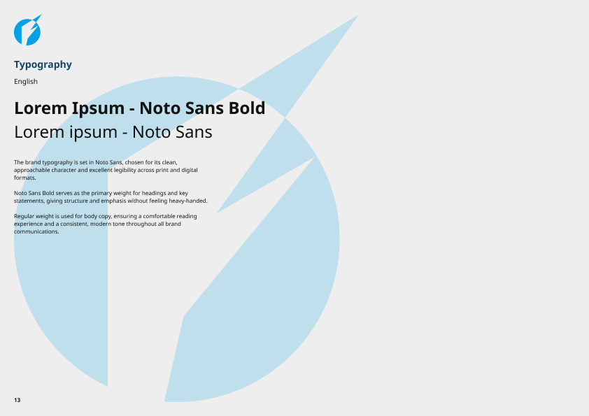
This included defining the company's visual language, typography, colour palette, logo usage, imagery & supporting graphic elements to create a cohesive & recognisable brand system.
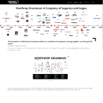
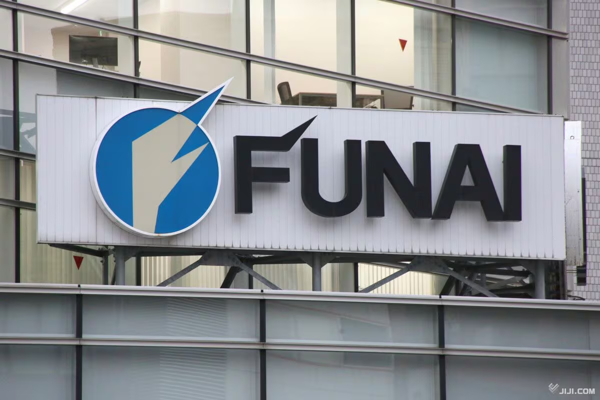
Although the company is fictional, the branding was informed by the visual characteristics & communication styles commonly found within the defence, aerospace & industrial manufacturing sectors as well as the real world (now defunct) company Funai.
One of the primary challenges was creating a brand that felt authentic within the defence industry while remaining distinctive.
The identity needed to convey reliability, engineering excellence & innovation without relying on overused military clichés or overly aggressive visual elements.
Another challenge was designing a system that could scale across a wide variety of touch-points.
The brand needed to remain consistent whether applied to digital interfaces, technical documentation, marketing material, uniforms, vehicle livery, or corporate presentations.
Because the project was entirely self-directed, I also established the company's positioning, values & visual direction before beginning the design work, based on the real-life Funai company, ensuring that every design decision supported a clear brand strategy.
The project began with research into established defence, aerospace, engineering & industrial brands to understand how they communicate trust, capability & technical expertise through design.
Using these insights, I developed a visual direction centred around precision, structure & modern engineering.
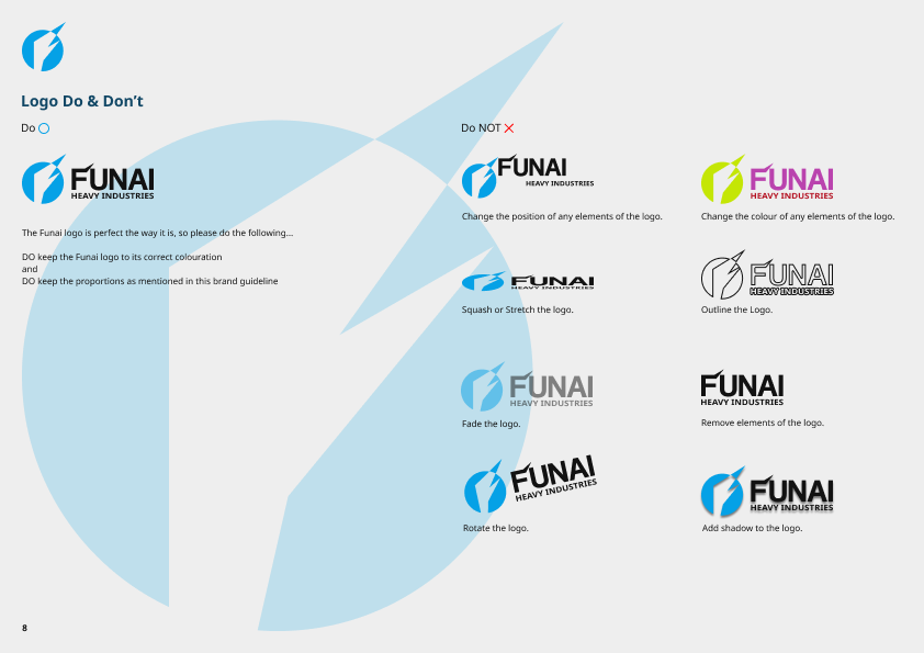
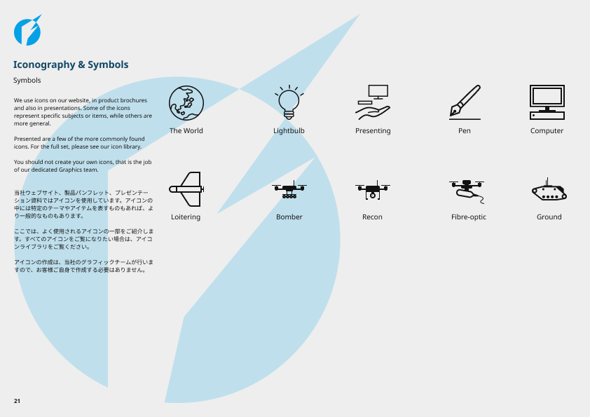
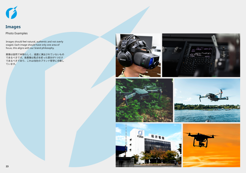
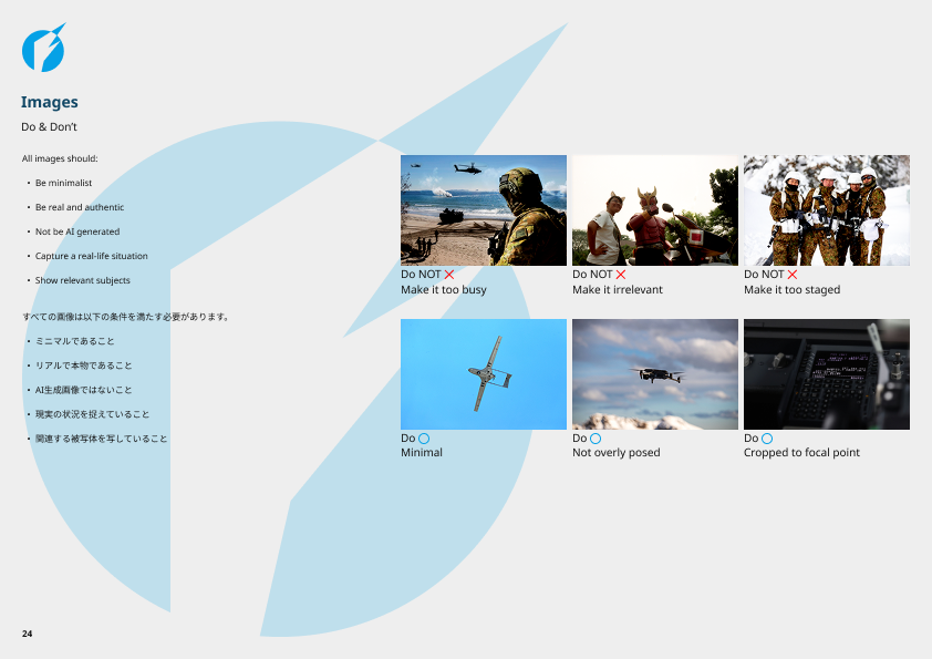
Once the core identity was established, I defined the supporting brand system, including typography, colour palette, logo clear space, sizing rules, iconography, photography direction & layout principles.
These elements were documented within a brand guideline to ensure the identity could be applied consistently across future assets.
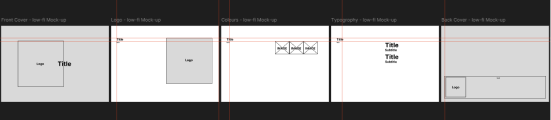
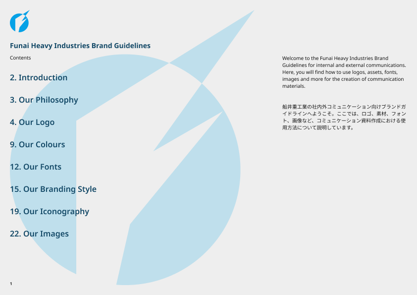
The initial concepts focused on organising brand elements into clear, structured sections, making the guidelines easy to navigate & ensuring key information could be found quickly.
I explored several approaches to the document structure before refining the visual system with a consistent grid, typography hierarchy, colour palette & reusable layout components to create a cohesive & scalable brand guideline.
Throughout the project, every design decision aimed to improve clarity, maintain consistency & provide straightforward guidance that supports accurate & confident application of the brand across all touchpoints.
Between the Initial ideas & the high-fidelity mock-ups, it became clear that the required information would work best spread over multi-paged sections, as seen with the jump from around 5 pages to 26 pages.
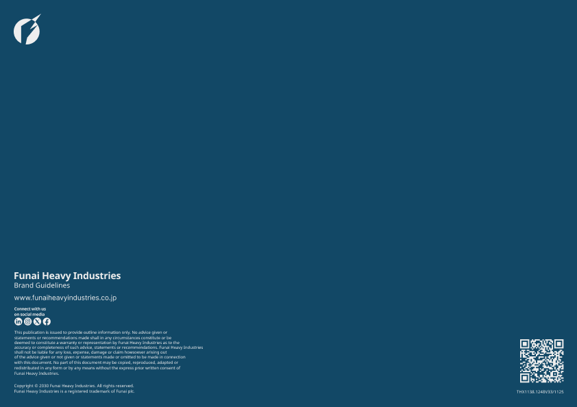
The final outcome is a comprehensive brand guideline that establishes a clear & consistent identity for Funai Heavy Industries.
The guideline defines how the visual identity should be applied across a variety of mediums, ensuring consistency regardless of application.
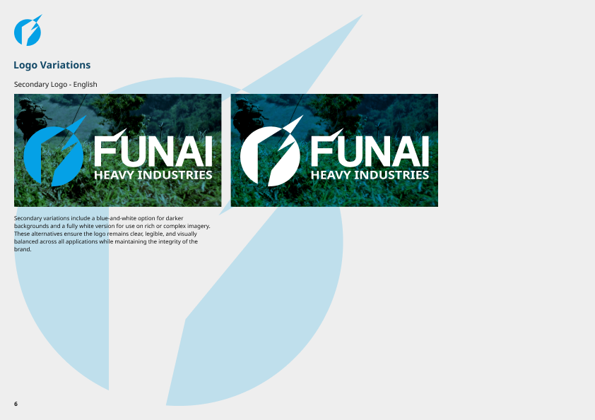
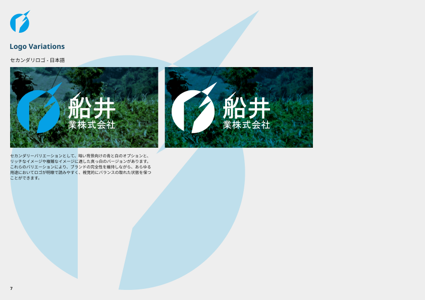
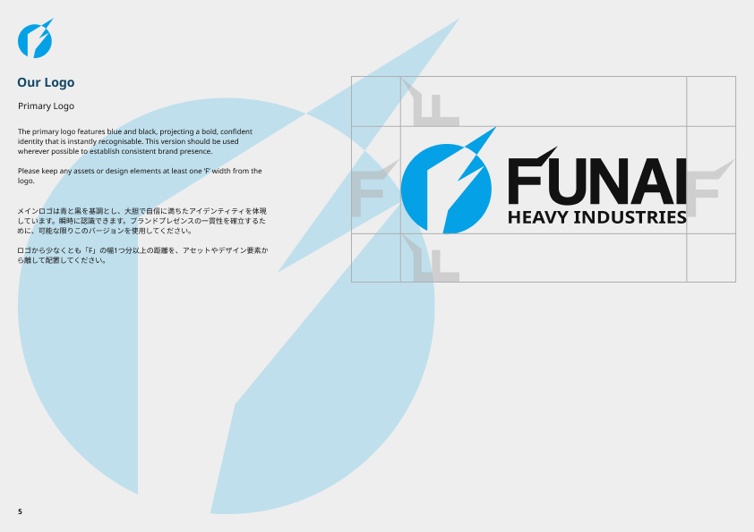
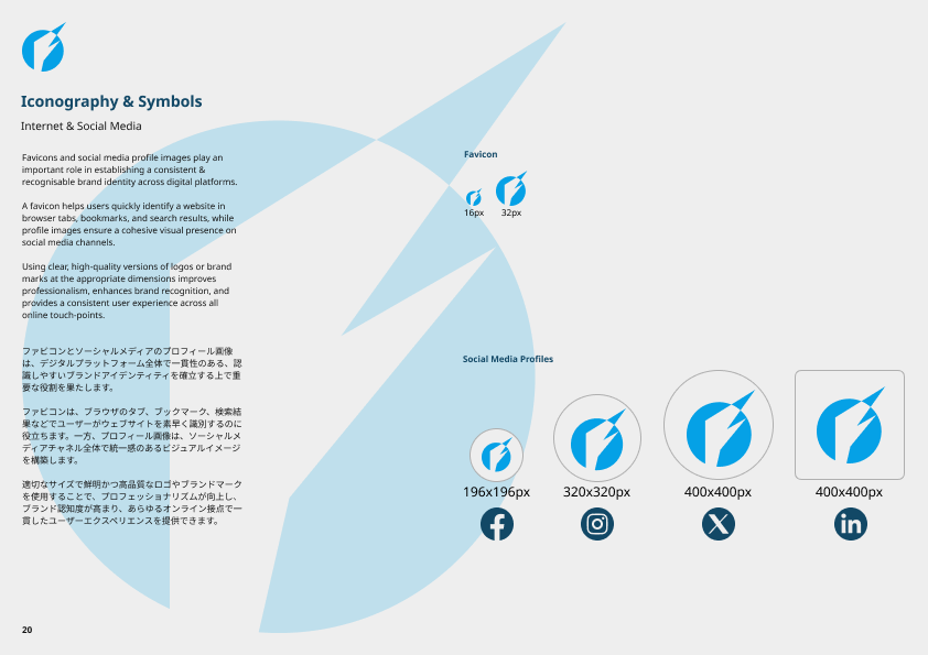
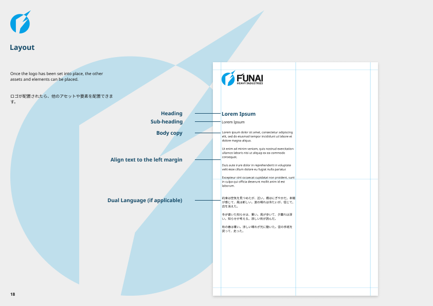
It includes logo variations, colour specifications, typography standards, spacing rules, imagery guidance & examples of the brand in practical use.
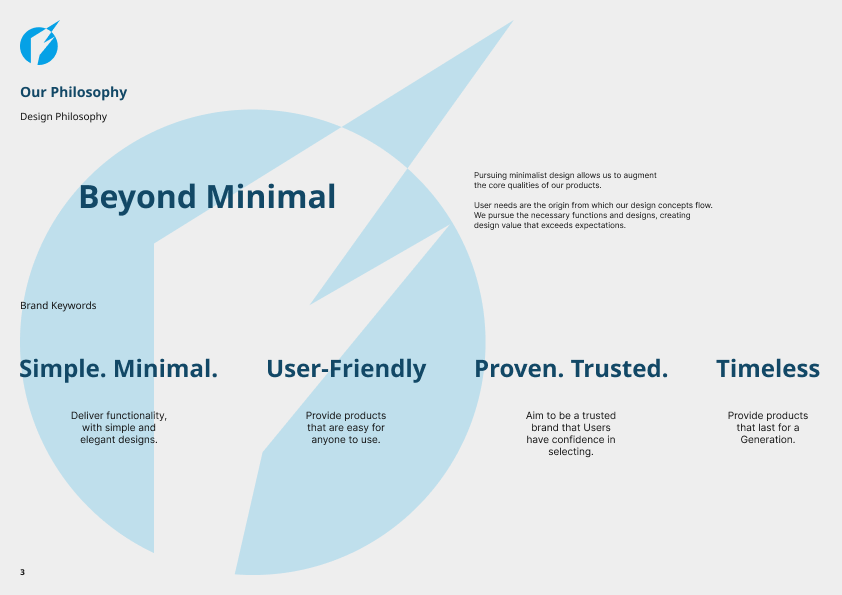
The identity balances professionalism with a modern industrial aesthetic, using a restrained visual language that reflects precision engineering & operational reliability.
By documenting these standards, the brand becomes scalable, recognisable & adaptable to future products, communications & digital experiences.
A link to the Flipbook version can be found here.
This project reinforced that successful branding extends far beyond designing a logo.
Building a complete identity system required considering how every visual element contributes to the perception of the organisation & how those elements work together across different contexts.
Creating the brand guidelines also strengthened my understanding of consistency & scalability.
Defining clear standards ensures that a brand can be applied confidently by different designers & across a wide range of media without losing its identity.
If I were to continue developing the project, I would expand the guideline with additional applications such as environmental graphics, vehicle liveries, exhibition materials, digital templates & a comprehensive design system for future products and interfaces.
Overall, the project helped me develop a more strategic approach to branding by combining visual design with long-term system thinking & practical implementation.
Funai HI.
01. Project Overview
02. Challenges
03. Process
04. Solution
05. Reflection
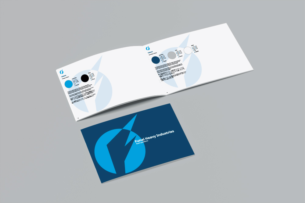


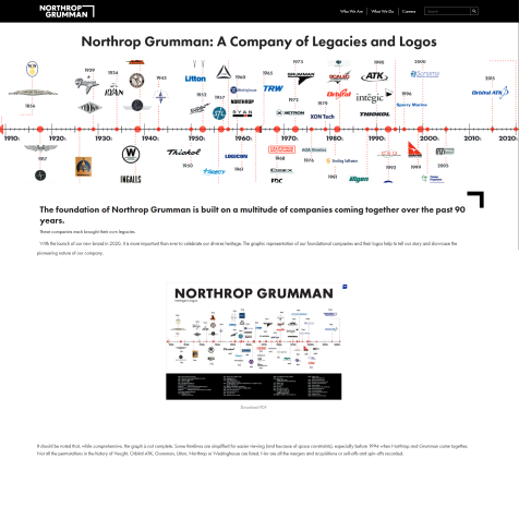
To ensure visual consistency; between working on the mid-fi mock-ups & the hi-fi mock-ups I developed a compact style guide, based on the real-life Funai, that would define the project's base going forward.
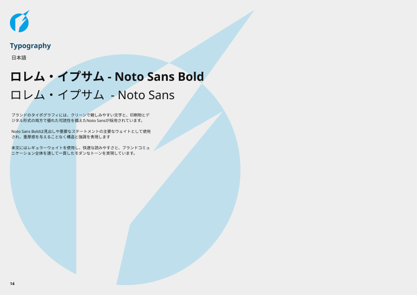
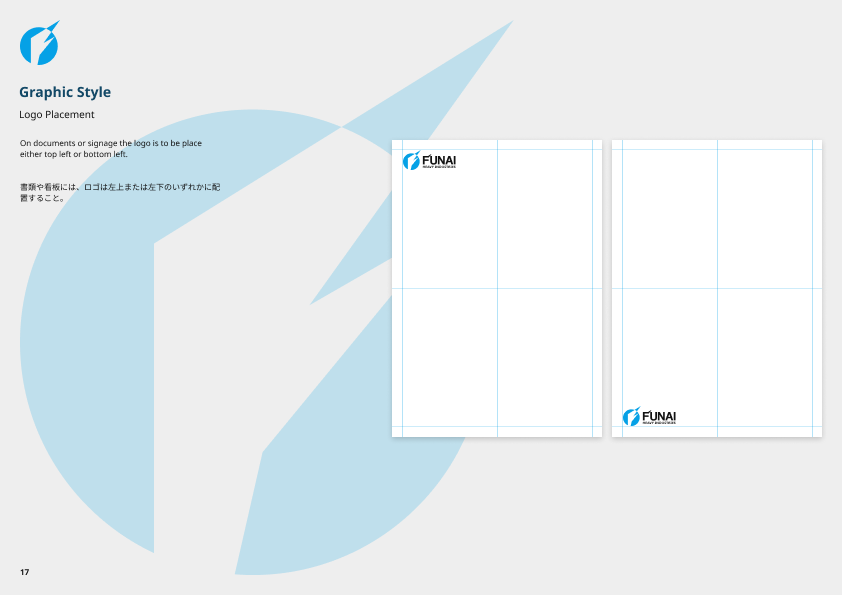
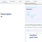
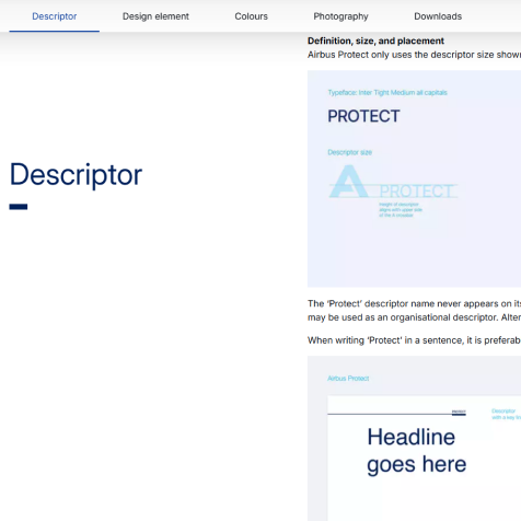
With the initial visual direction established, I developed a series of medium-fidelity designs to explore how the identity could be applied across both print & digital.
These layouts allowed me to refine the typography, colour palette, grid system & overall visual hierarchy before progressing to the final brand guidelines.


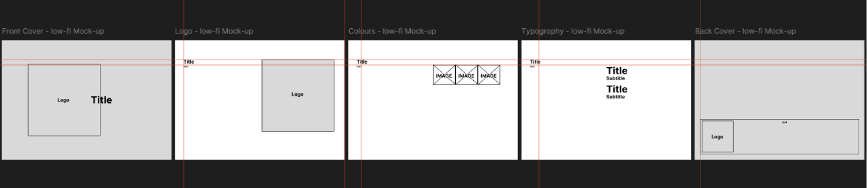
Wireframe & low-fidelity page layouts exploring information hierarchy
Medium-fidelity page layout & asset design
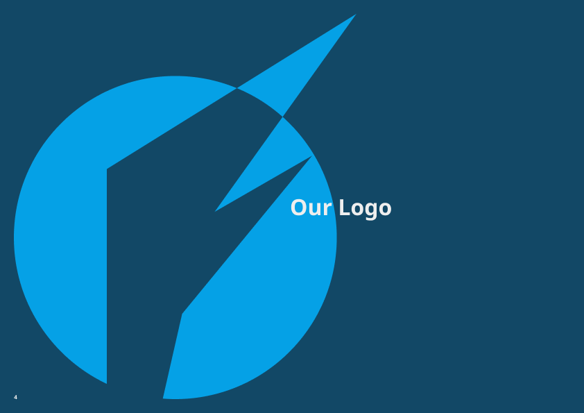

Flipbook version can be found here.
// END OF CASE STUDY
ADAM
WHEELER
GRAPHICDESIGNER
Creative. Precise. Professional.


PORTFOLIO

Adam Wheeler
GD Case Studies
UX Case Studies
About
Contact
Copyright Adam Wheeler. All rights reserved
Funai Heavy Industries is a fictional defence manufacturer created as a personal branding project.
The objective was to develop a comprehensive brand identity & accompanying brand guidelines that communicate strength, precision & technological innovation while maintaining a professional & credible visual presence.
Rather than designing a single logo, the project explored how a defence company's identity could be expressed consistently across a range of applications.
This included defining the company's visual language, typography, colour palette, logo usage, imagery & supporting graphic elements to create a cohesive & recognisable brand system.
Although the company is fictional, the branding was informed by the visual characteristics & communication styles commonly found within the defence, aerospace & industrial manufacturing sectors as well as the real world (now defunct) company Funai.
One of the primary challenges was creating a brand that felt authentic within the defence industry while remaining distinctive.
The identity needed to convey reliability, engineering excellence & innovation without relying on overused military clichés or overly aggressive visual elements.
Another challenge was designing a system that could scale across a wide variety of touch-points.
The brand needed to remain consistent whether applied to digital interfaces, technical documentation, marketing material, uniforms, vehicle livery, or corporate presentations.
Because the project was entirely self-directed, I also established the company's positioning, values & visual direction before beginning the design work, based on the real-life Funai company, ensuring that every design decision supported a clear brand strategy.
The project began with research into established defence, aerospace, engineering & industrial brands to understand how they communicate trust, capability & technical expertise through design.
Using these insights, I developed a visual direction centred around precision, structure & modern engineering.
Once the core identity was established, I defined the supporting brand system, including typography, colour palette, logo clear space, sizing rules, iconography, photography direction & layout principles.
These elements were documented within a brand guideline to ensure the identity could be applied consistently across future assets.
The initial concepts focused on organising brand elements into clear, structured sections, making the guidelines easy to navigate & ensuring key information could be found quickly.
I explored several approaches to the document structure before refining the visual system with a consistent grid, typography hierarchy, colour palette & reusable layout components to create a cohesive & scalable brand guideline.
Throughout the project, every design decision aimed to improve clarity, maintain consistency & provide straightforward guidance that supports accurate & confident application of the brand across all touchpoints.
Between the Initial ideas & the high-fidelity mock-ups, it became clear that the required information would work best spread over multi-paged sections, as seen with the jump from around 5 pages to 26 pages.
The final outcome is a comprehensive brand guideline that establishes a clear & consistent identity for Funai Heavy Industries.
The guideline defines how the visual identity should be applied across a variety of mediums, ensuring consistency regardless of application.
It includes logo variations, colour specifications, typography standards, spacing rules, imagery guidance & examples of the brand in practical use.
The identity balances professionalism with a modern industrial aesthetic, using a restrained visual language that reflects precision engineering & operational reliability.
By documenting these standards, the brand becomes scalable, recognisable & adaptable to future products, communications & digital experiences.
A link to the Flipbook version can be found here.
This project reinforced that successful branding extends far beyond designing a logo.
Building a complete identity system required considering how every visual element contributes to the perception of the organisation & how those elements work together across different contexts.
Creating the brand guidelines also strengthened my understanding of consistency & scalability.
Defining clear standards ensures that a brand can be applied confidently by different designers & across a wide range of media without losing its identity.
If I were to continue developing the project, I would expand the guideline with additional applications such as environmental graphics, vehicle liveries, exhibition materials, digital templates & a comprehensive design system for future products and interfaces.
Overall, the project helped me develop a more strategic approach to branding by combining visual design with long-term system thinking & practical implementation.
Funai HI.
01. Project Overview
02. Challenges
03. Process
04. Solution
05. Reflection


To ensure visual consistency; between working on the mid-fi mock-ups & the hi-fi mock-ups I developed a compact style guide, based on the real-life Funai, that would define the project's base going forward.
With the initial visual direction established, I developed a series of medium-fidelity designs to explore how the identity could be applied across both print & digital.
These layouts allowed me to refine the typography, colour palette, grid system & overall visual hierarchy before progressing to the final brand guidelines.


Wireframe & low-fidelity page layouts exploring information hierarchy
Medium-fidelity page layout & asset design
Flipbook version can be found here.
// END OF CASE STUDY