ADAM
WHEELER
GRAPHICDESIGNER
Creative. Precise. Professional.


Adam Wheeler
GD Case Studies
UX Case Studies
About
Contact
Copyright Adam Wheeler. All rights reserved


HantuCorp is a fictional defence technology company created as the foundation for this personal UI design project.
The objective was to design a modern Command & Control (C2) dashboard that enables operators to monitor missions, track assets, assess threats & make informed decisions in time-sensitive environments.
This project was an opportunity to explore interface design for complex, data-rich systems rather than traditional consumer applications. I wanted to challenge myself with designing an experience where clarity, hierarchy & usability are critical, ensuring that important information can be understood at a glance without overwhelming the user.
Although the company & scenario are fictional, the project draws inspiration from real-world command centres, mission planning software & defence technology workflows. The focus was on creating an interface that feels credible, intuitive & purpose-built for high-pressure operational environments.
Designing for a command & control environment presented a very different set of challenges compared to typical digital products.
The interface needed to communicate a large amount of operational information while remaining readable & easy to navigate. Maps, live asset locations, mission status, alerts, communication feeds & supporting data all compete for the user's attention, making information hierarchy one of the biggest design considerations.
Another challenge was balancing functionality with simplicity.
Professional software often prioritises capability over usability, resulting in cluttered interfaces.
My goal was to create a dashboard that could support complex decision-making without introducing unnecessary visual noise.
Because this was a fictional project, I also had to define the operational context myself, establishing user goals, workflows & information priorities before designing the interface.
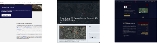
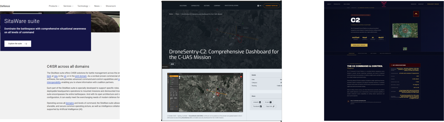
I began by researching command & control systems, military operations centres & aviation dashboards to understand how complex operational data is commonly presented.
From there, I identified the primary information an operator would need during a mission, including situational awareness, asset tracking, mission objectives, communications & system health.
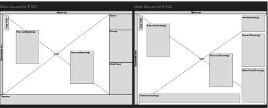
This helped establish a clear hierarchy before moving into wire-frames.
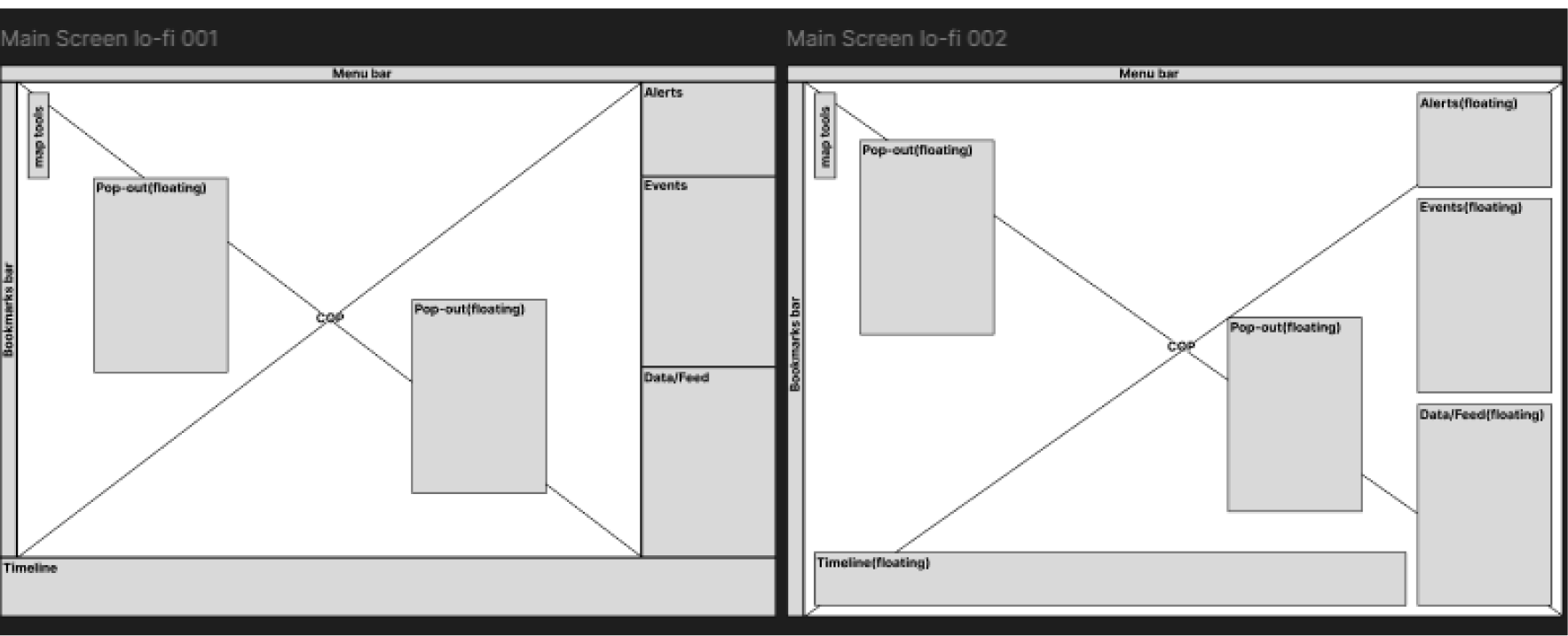
Early layouts focused on organising information into distinct functional regions, allowing users to quickly scan the dashboard without losing context.
I iterated on several layout concepts before refining the visual design with a consistent grid, typography system, colour palette & reusable UI components.
Throughout the project, every design decision aimed to improve readability, reduce cognitive load & surface the most critical information first.
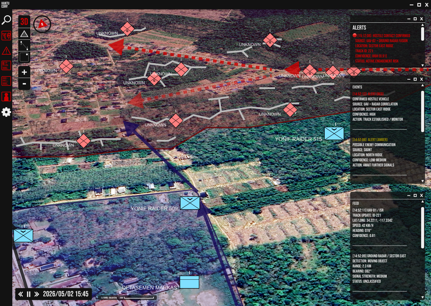
The final design delivers a clean, modern command & control dashboard centred around situational awareness.
The interface places the operational map at the centre of the experience, supported by modular panels containing mission status, active assets, alerts, communication logs & key performance indicators.
Visual hierarchy, spacing & colour are used intentionally to distinguish critical information from supporting data, allowing operators to identify important events quickly.
Reusable components create consistency across the interface, while the overall layout remains flexible enough to accommodate different mission types & operational scenarios.
The result is a dashboard that feels professional, scalable & focused on enabling fast, confident decision-making in high-pressure environments.
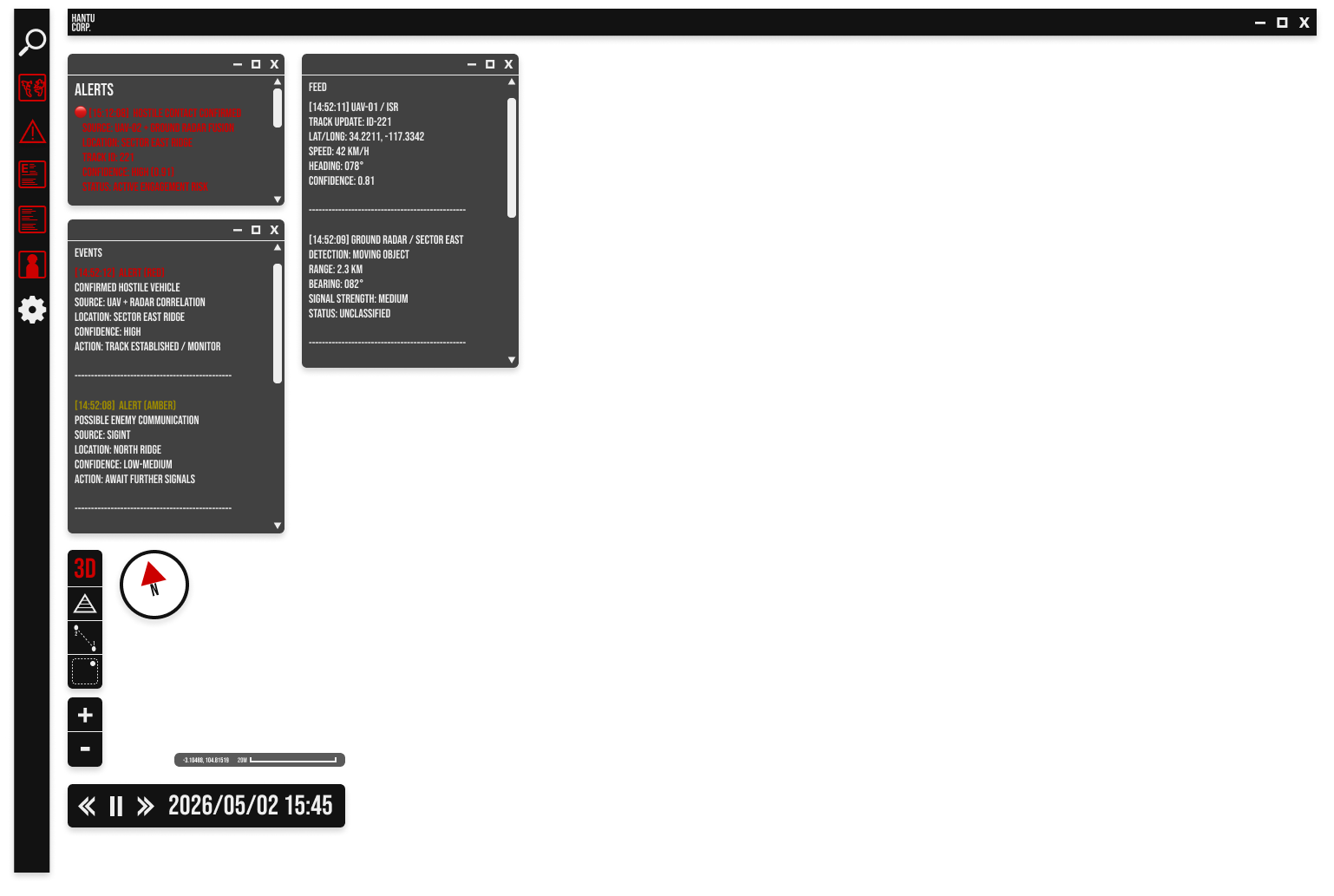
After stepping away from the design for a couple of weeks and looking at it with fresh eyes, certain things became apparent, combining this with further feedback from outside sources brought about a list of necessary changes.
The results of which became the refined design below.
This project allowed me to explore a design space that is significantly more complex than most consumer-facing products.
It reinforced the importance of information architecture, hierarchy & designing for users who rely on speed & accuracy rather than visual novelty.
One of the biggest takeaways was learning how to simplify complex information without reducing its usefulness.
Every element on the screen needed a clear purpose & removing unnecessary visual clutter often improved the overall experience more than adding new features.
If I continued developing the project, I would expand the system into a complete design system with additional workflows for mission planning, communications, asset management & post-mission analysis.
I would also validate the interface through usability testing & iterate based on user feedback to better reflect real operational requirements.
Overall, this project strengthened my ability to design complex, data-intensive interfaces while balancing functionality with usability.
Hantu Corp.

01. Project Overview
02. Challenges
03. Process
04. Solution
05. Reflection
Conceptual Graphic Design case study based on publicly available information
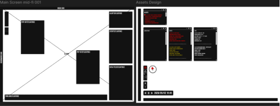
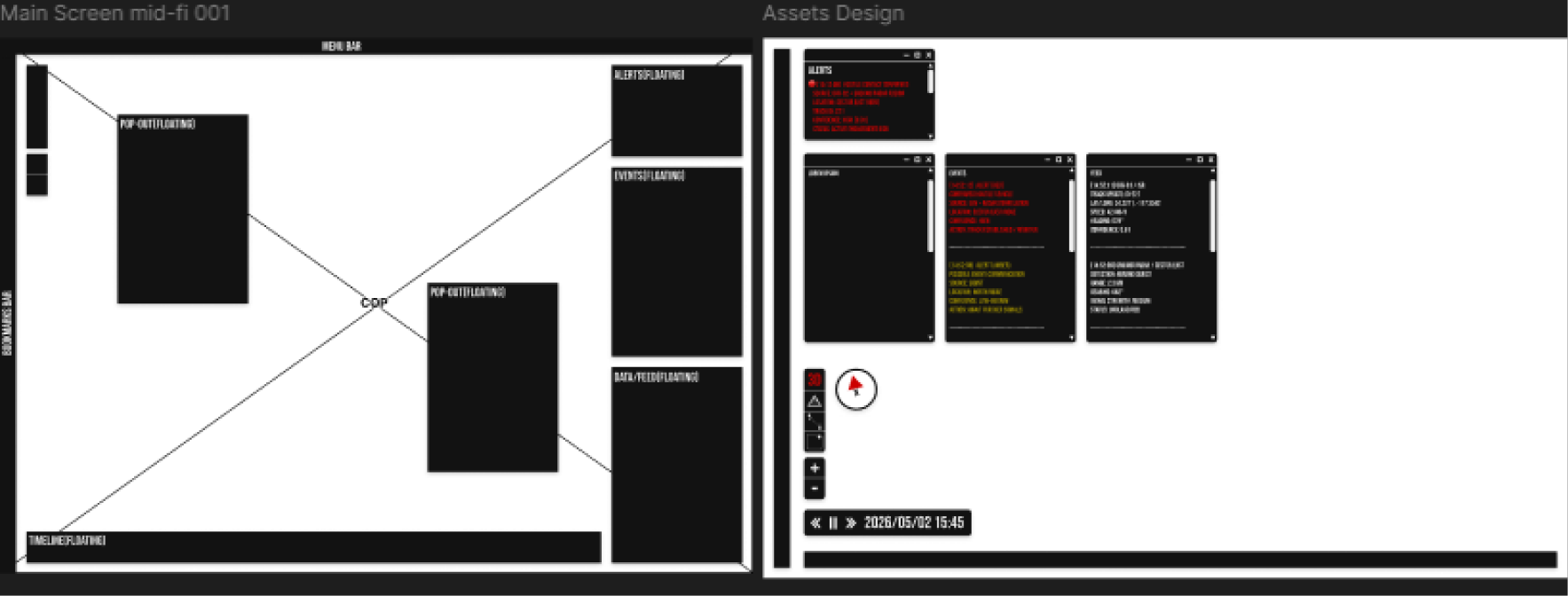
Medium-fidelity page layout & asset design
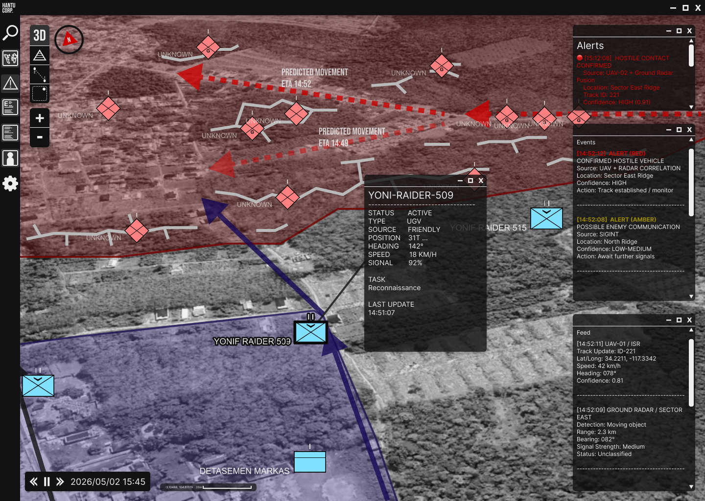
First round of high-fidelity mock-ups & asset design

To ensure visual consistency; between working on the mid-fi mock-ups & the hi-fi mock-ups I developed a compact brand guideline that would define the project's typography, colour palette & logo usage.
Wireframe & low-fidelity page layouts exploring information hierarchy

© 2030 Hantu Corp.
Hantu
Corp.
Maphilindo
Project
The
// END OF CASE STUDY
ADAM
WHEELER
GRAPHICDESIGNER
Creative. Precise. Professional.


PORTFOLIO

Adam Wheeler
GD Case Studies
UX Case Studies
About
Contact
Copyright Adam Wheeler. All rights reserved


HantuCorp is a fictional defence technology company created as the foundation for this personal UI design project.
The objective was to design a modern Command & Control (C2) dashboard that enables operators to monitor missions, track assets, assess threats & make informed decisions in time-sensitive environments.
This project was an opportunity to explore interface design for complex, data-rich systems rather than traditional consumer applications. I wanted to challenge myself with designing an experience where clarity, hierarchy & usability are critical, ensuring that important information can be understood at a glance without overwhelming the user.
Although the company & scenario are fictional, the project draws inspiration from real-world command centres, mission planning software & defence technology workflows. The focus was on creating an interface that feels credible, intuitive & purpose-built for high-pressure operational environments.
Designing for a command & control environment presented a very different set of challenges compared to typical digital products.
The interface needed to communicate a large amount of operational information while remaining readable & easy to navigate. Maps, live asset locations, mission status, alerts, communication feeds & supporting data all compete for the user's attention, making information hierarchy one of the biggest design considerations.
Another challenge was balancing functionality with simplicity.
Professional software often prioritises capability over usability, resulting in cluttered interfaces.
My goal was to create a dashboard that could support complex decision-making without introducing unnecessary visual noise.
Because this was a fictional project, I also had to define the operational context myself, establishing user goals, workflows & information priorities before designing the interface.
I began by researching command & control systems, military operations centres & aviation dashboards to understand how complex operational data is commonly presented.
From there, I identified the primary information an operator would need during a mission, including situational awareness, asset tracking, mission objectives, communications & system health.
This helped establish a clear hierarchy before moving into wire-frames.
Early layouts focused on organising information into distinct functional regions, allowing users to quickly scan the dashboard without losing context.
I iterated on several layout concepts before refining the visual design with a consistent grid, typography system, colour palette & reusable UI components.
Throughout the project, every design decision aimed to improve readability, reduce cognitive load & surface the most critical information first.
The final design delivers a clean, modern command & control dashboard centred around situational awareness.
The interface places the operational map at the centre of the experience, supported by modular panels containing mission status, active assets, alerts, communication logs & key performance indicators.
Visual hierarchy, spacing & colour are used intentionally to distinguish critical information from supporting data, allowing operators to identify important events quickly.
Reusable components create consistency across the interface, while the overall layout remains flexible enough to accommodate different mission types & operational scenarios.
The result is a dashboard that feels professional, scalable & focused on enabling fast, confident decision-making in high-pressure environments.
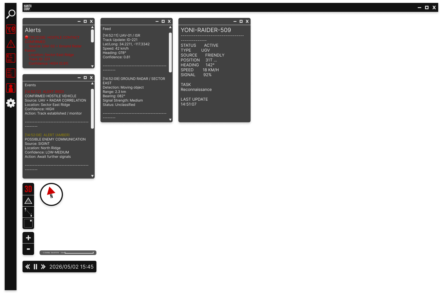
After stepping away from the design for a couple of weeks and looking at it with fresh eyes, certain things became apparent, combining this with further feedback from outside sources brought about a list of necessary changes.
The results of which became the refined design below.
This project allowed me to explore a design space that is significantly more complex than most consumer-facing products.
It reinforced the importance of information architecture, hierarchy & designing for users who rely on speed & accuracy rather than visual novelty.
One of the biggest takeaways was learning how to simplify complex information without reducing its usefulness.
Every element on the screen needed a clear purpose & removing unnecessary visual clutter often improved the overall experience more than adding new features.
If I continued developing the project, I would expand the system into a complete design system with additional workflows for mission planning, communications, asset management & post-mission analysis.
I would also validate the interface through usability testing & iterate based on user feedback to better reflect real operational requirements.
Overall, this project strengthened my ability to design complex, data-intensive interfaces while balancing functionality with usability.
Hantu Corp.

01. Project Overview
02. Challenges
03. Process
04. Solution
05. Reflection
Conceptual Graphic Design case study based on publicly available information
Medium-fidelity page layout & asset design
First round of high-fidelity mock-ups & asset design

To ensure visual consistency; between working on the mid-fi mock-ups & the hi-fi mock-ups I developed a compact brand guideline that would define the project's typography, colour palette & logo usage.
Wireframe & low-fidelity page layouts exploring information hierarchy

© 2030 Hantu Corp.
Hantu
Corp.
Maphilindo
Project
The
// END OF CASE STUDY